
A practical guide to UX for interfaces that use AI
Learn how to design states, feedback, review, sources, and recovery for AI interfaces without hiding limitations or taking control away from users.
A good AI interface does not need to pretend certainty. It needs to help people understand task state, review the result, correct the path, and stay in control of consequential actions.
UX for AI starts with the task, not the chat
An AI feature often starts in a simple form: a text field, a button, and an area for the answer. That structure may be enough for an experiment, but its limits appear when AI becomes part of a real task.
A person may need to attach context, choose a goal, wait through several stages, check sources, correct part of the result, retry, or confirm an action. At that point, the problem is no longer just sending a prompt and rendering text. It becomes designing an experience that remains understandable when processing takes time, the answer is incomplete, or the system needs more information.
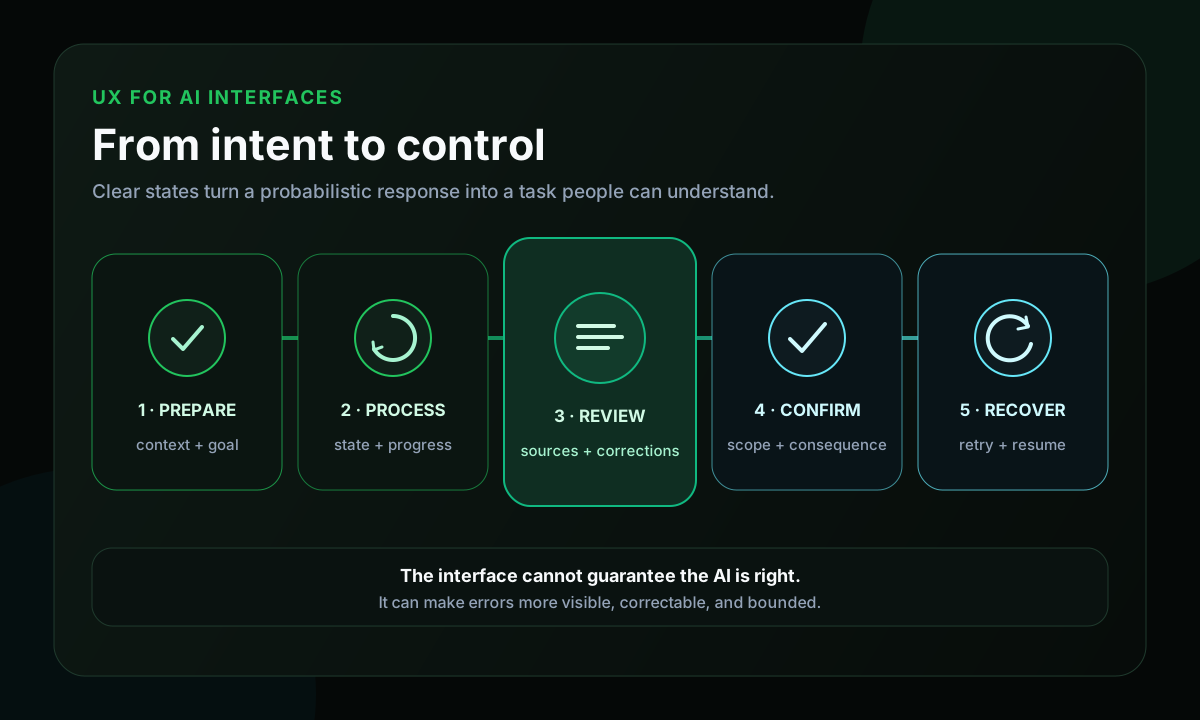
A text box does not solve the whole experience
Chat is a flexible pattern. It works well when conversation is a natural part of the problem, when users need to explore possibilities, or when there is no single path. But that flexibility also transfers work to the user: figuring out what to ask, how much context to provide, how to assess the answer, and what to do next.
For predictable tasks, a guided flow may be clearer. If the system extracts fields from an invoice, an upload followed by structured review may work better. If it compares alternatives, a table may help more than a long answer. If it edits text, showing differences and accepting changes by section may be better than replacing everything.
- Which task needs to be completed?
- Which information is required?
- Does the result have an expected format?
- Is there a consequential action afterward?
- Which errors are likely, and how can the person recover?
AI is part of the behavior. It does not need to determine the interface format by itself.
Prepare context and expectations before generation
A poor experience often starts before processing. The system accepts any input, does not explain what it needs, and reveals the problem only after a failed attempt. It is more useful to clarify accepted content, the task goal, required data, what should not be submitted, and how much control the person will have over the result.
This does not require a huge form. Short examples, defaults, and guided choices can reduce known ambiguity. Interface copy should also reflect the real role of AI: `create a first analysis` communicates reviewability better than `generate the final analysis`.
Show progress without inventing precision
AI tasks can vary widely in duration. A spinner without context leaves people unsure whether the system started, stalled, or lost the request. A progress bar that moves artificially to 95% can also create more anxiety than an honest message about the current stage.
1ready to start2validating data3processing4needs more information5partial result available6completed7failed with a recovery path8cancellation requested9canceledThese states should represent system facts. The interface can show observable actions such as `3 of 8 files analyzed` or `validating extracted fields` without exposing the model's internal reasoning. When a safe partial result exists, showing it may be better than blocking the entire screen, provided it is clear what may still change.
Make the output reviewable and traceable
A generated answer should not behave like a final verdict when the task itself contains uncertainty. Separating summary, details, and next steps; highlighting pending fields; allowing direct edits; comparing versions; and retrying only one section make review more manageable.
A generic `Regenerate` button can discard an almost-good result and produce something very different. Actions such as `make it shorter`, `revise this section`, or `retry only failed items` preserve more context and reduce rework.
When an answer depends on documents or external data, clickable sources help verify context. A confidence indicator without a clear definition may imply precision that does not exist. If a score is displayed, its origin and consequence need to be understandable.
Preserve control before consequential actions
There is a difference between generating a suggestion and acting in the world. Drafting an email can support a lightweight interaction. Sending that email, deleting a record, publishing content, or changing a setting requires confirmation and traceability proportional to the risk.
- Show exactly what will happen, including destination and scope.
- Ask for confirmation where a decision changes the result or creates an external consequence.
- Allow undo when technically possible.
- Record outcomes and failures in an understandable way.
- Avoid broad permissions for a small task.
Confirmation should not become noise either. Approving every micro-step can make the workflow impractical. The criterion is to involve the person where there is a meaningful change in state, cost, or consequence.
Error and recovery are part of the flow
A task may fail because of an invalid file, insufficient context, a limit, an outage, an output that does not match the format, or a tool without permission. Recovery messaging should explain what did not finish, what was preserved, whether retrying is safe, and which action may resolve the problem.
It is also useful to distinguish total failure from a partial result. If seven of ten items were processed, deleting everything because of the remaining three may be a poor decision. The interface can let people review what worked and retry only what is necessary.
A practical example: document summarization
Imagine a document summarization flow. Before submitting, the person chooses files, sees accepted formats, and defines the goal: an executive summary, decision points, or open questions. The interface explains relevant limits and which data should not be submitted.
The system then shows progress by file. One invalid document does not automatically block the others. In the result, each important claim points to a source passage, while items without enough context are marked for review. The person edits, retries one section, and only then exports or shares.
This flow does not guarantee that the AI is right. It makes errors easier to notice, correct, and contain.
How to validate the experience
It is not enough to ask whether the screen looks modern. I would observe people trying to complete real tasks: do they understand what to provide, know when the system needs them, distinguish partial from complete results, find sources, correct without starting over, and understand an action before confirming it?
Completion rate, abandonment during processing, retries, share of edited results, failures by stage, and time to a usable result can help locate friction. No single metric proves quality, so quantitative signals need to be combined with observation and result evaluation.
Accessibility follows state too
State changes need to work for people who are not visually tracking the screen. WCAG 2.2 Success Criterion 4.1.3 requires status messages to be programmatically determinable so assistive technologies can present them without moving focus. This is especially relevant to waiting, progress, results, and errors in AI tasks.
Focus should not disappear after generation, actions need to work by keyboard, and color or animation cannot be the only way to communicate progress and failure. Live regions and alerts also require restraint: too many updates can make the experience excessively chatty for screen reader users.
A minimum checklist for an AI interface
- Is the task clear before the first prompt?
- Are required data and limitations visible?
- Does the current state represent a system fact?
- Does the person know when they need to act?
- Can the result be verified and corrected?
- Are sources shown when they are part of the answer?
- Do consequential actions require confirmation proportional to risk?
- Do errors preserve what is still useful?
- Is there a safe way to retry, cancel, or resume?
- Does the flow work with keyboard, screen readers, and reduced motion?
Limitations and caveats
There is no universal interface for AI. An exploratory tool, an internal classification flow, and an action that publishes content carry different risks. Transparency does not mean exposing the entire implementation either: the goal is to show what helps a person decide and act.
UX cannot fix an unsuitable model, poor data, or missing evaluation. The interface can reduce impact and make review easier, but quality still depends on the complete system.
Conclusion
Good UX for AI does not try to erase all uncertainty with animation or optimistic messages. It organizes uncertainty so people can move forward with context and control.
Starting from the task, designing honest states, making results reviewable, and planning recovery are often more important than deciding whether the interface will look like chat. AI can remain probabilistic; the experience around it does not need to be confusing.